
year-progress
Year in Pixels: How the Mood Grid Works All 365 Days
by One Percent Editorial Team8 min read
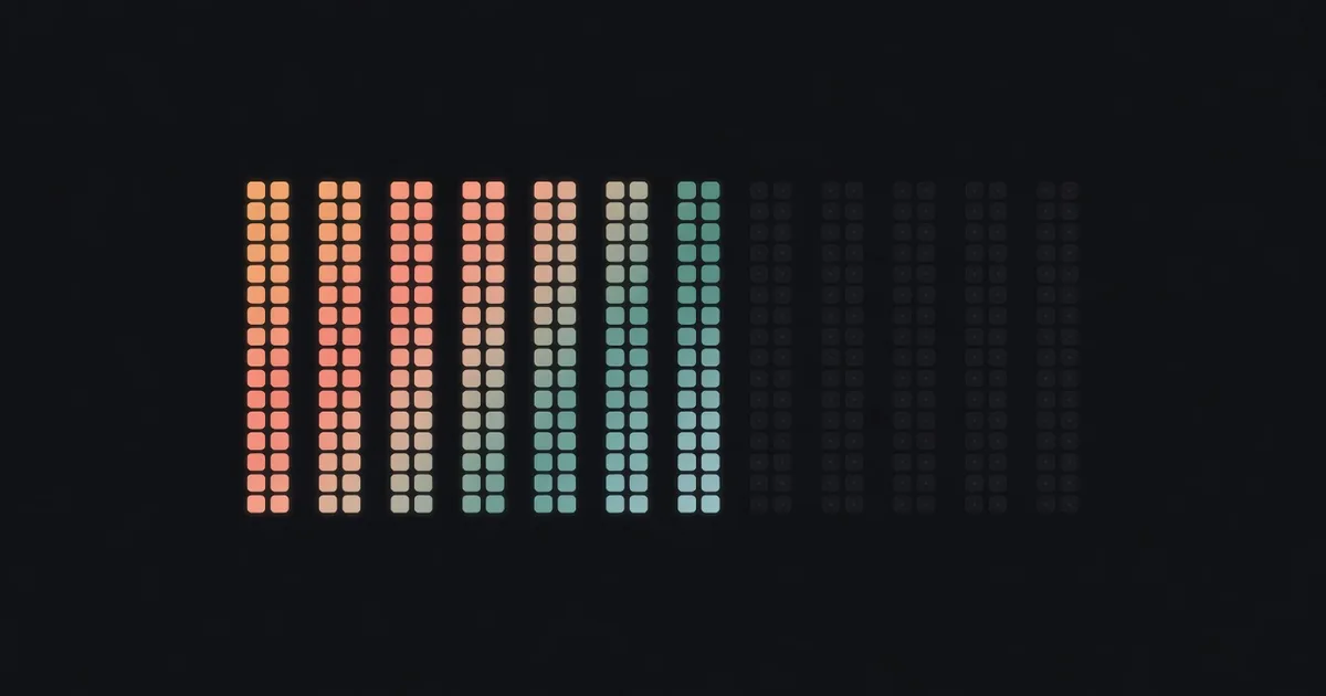
A year in pixels is a single grid that holds your whole year: twelve columns for the months, thirty-one rows for the days, one colored square per day. Each evening you pick the color that matches your dominant mood and fill one cell. By December you can read your year the way you read a heatmap, and the patterns show up whether or not you ever write a word about them.
The method costs about two minutes a day. The hard part is not the grid. The hard part is still filling it in on an average Tuesday in March, and that is what this guide actually solves.
Where the method comes from
The year in pixels comes from the bullet journal community. Camille of Passion Carnets, a French bullet journaler, built the first one in December 2015 after a few months of tracker experiments, and the official Bullet Journal blog tells the story in her own words. Her point about the method still holds: by the time you have picked one color for the day, you have already weighed what happened and decided what mattered. The color is the receipt; the reflection is the product.
Since then the spread has become one of the most copied pages in journaling, with printable templates in every style. The format survived because it fixes a real problem with monthly mood trackers: a month is too short to show a pattern. One year on one page is the whole trick.
Set up your grid
You need three decisions before day one, and they take ten minutes together.
Draw or print the grid first. Twelve columns across, labeled January through December. Thirty-one rows down, labeled 1 through 31. Cross out the cells that do not exist, like February 30. On paper that is a ruler and patience; in an app the grid ships ready.
Pick your scale second, and keep it between four and six moods. A common set: great, good, neutral, low, rough. More granularity feels rigorous and works worse, because a fifteen-color legend turns every evening into a quiz. You want a scale you can answer in five seconds without negotiating with yourself.
Assign colors last, and make the order readable at a distance. Warm-to-cool gradients work: the point of the grid is the pattern, and a pattern only appears when similar days look similar. Random favorite colors produce confetti, not information.
Fill it in without lying to yourself
One square per day, chosen for the dominant mood, not the average. A day with a rough morning and a good evening gets whichever actually owned the day. You are ranking, not computing.
Fill the square at the same anchor point every day. After you brush your teeth, after you plug in your phone, whenever, but the same moment daily. A floating habit dies in week three; an anchored one survives. If you want the science behind that, the habit-building guide covers what the research actually says about how long automation takes.
Two rules keep the record honest. First, no retro-painting: if you cannot remember Tuesday, leave Tuesday blank instead of guessing a flattering color. Blank cells are data too. Second, no grade inflation: a neutral year that reads as neutral is a successful tracker. A grid that is all sunshine yellow is not a good year, it is a broken scale.
What the grid shows you in December
Around month three the grid starts paying rent. You see weekly rhythms: many people find one recurring weekday consistently darker than the rest, and that is a schedule problem you can act on, not a personality flaw. You see event shadows: a move, a crunch at work, a breakup, each leaves a visible band. You see recovery time, which is the one number nobody estimates well about themselves.
What a mood grid does not do is explain itself. A dark week in October tells you the week was dark; it cannot tell you why. That limit is worth respecting, and it is the reason the method pairs so naturally with a line of context. If you want the color plus the why, a one-line-a-day journal is the matching habit, and a few daily reflection questions can supply the prompt when the day feels blank.
A boundary worth stating plainly: a year in pixels is a self-observation tool, not a screening tool. If your grid is showing you long dark stretches and that worries you, take it to a professional rather than to a prettier legend.
Paper grid or app
Paper gives you ritual and total freedom of format, and it asks for discipline in return: the notebook has to be there, the pens have to be there, and a missed week stares at you.
An app gives you the grid without the drawing, and it can hold more than a color. One Percent turns the year into a 365-dot view, records a short daily highlight and lowlight next to each day, and shows your notes and mood over time, so the "why" behind a color stays attached to the day it happened. Its iPhone widgets keep the year visible on your Home Screen, which quietly solves the biggest year in pixels failure mode: forgetting the grid exists. If you want to compare formats more broadly, the habit tracker comparison breaks down what each kind of tracker actually records.
You can view One Percent on the App Store. Whichever format you choose, choose the one you will still touch in November.
Frequently asked questions
What do I do about days I missed?
Leave them blank and keep going. A missed day is one empty cell in a grid of 365, and the pattern survives it easily. The tracker fails only when you treat a gap as a reason to stop, and the never-miss-twice rule is the practical fix for that spiral.
How many moods should my scale have?
Four to six. Below four, the grid flattens into noise; above six, the nightly choice gets slow enough that you start skipping it. If you regularly hover between two colors, your scale has a redundant step; merge them.
Can I track something other than mood?
Yes, the grid is format-agnostic. People run year in pixels grids for sleep quality, pain levels, workout days, or alcohol-free days. Keep one grid per question. A single grid that tries to encode mood and sleep and exercise in blended colors stops being readable, and readability is the entire point.
The app behind the dots
One Percent.
One Percent turns the year into a 365-dot view. One Percent records a short daily highlight and lowlight. One Percent shows daily notes and mood over time. One Percent provides iPhone widgets.